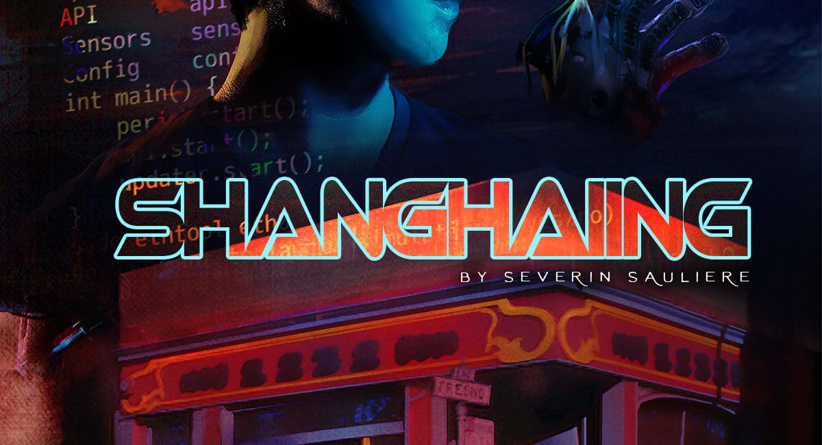
Interview by Dr. Sheena Howard with Severin Sauliere
Can you start by telling us a little more about the storyline behind your new comic, Shanghaiing?
In a nutshell the story is: In the basement of a San Francisco bar, Dorothy and James are conducting experiments to correct problematic biases in unsuspecting victims.
In this first episode, we meet our main protagonists and witness the embodiment sessions of Henry, a vocal critic of society’s most vulnerable people.
The story is a blend of 2 ideas: Shanghaiing and Virtual Reality.
First, Shanghaiing. I heard of it while living in San Francisco, someone told me about these really creepy stories: back in the early 1900s, sailors would be “recruited” – more like kidnapped – from bars in West Coast cities like San Francisco and Portland. They’d get drugged and carried through tunnels going from the bars straight to the port and wake up when already at sea, signed up to work on boats, without a way out.
I’m not sure if these are totally true stories but it stuck with me.
The second part is about Virtual Reality and its potential to create empathy by allowing users to see through someone else’s eyes, from their point of view. Multiple studies are reporting how our brains can’t differentiate some VR experiences from real ones.
I tied these 2 concepts together in the story of Dorothy and James, using their bar as a recruiting ground to correct biases in people walking through their door.
It’s unethical -and probably not very efficient but we will learn more about this in the rest of the series- and raises the question of how far we’d be willing to go to make people see the world as we do. Can we “force-feed” humanity into others?
Who is the creative team behind the project and how was the process of working with your team?
After writing the story, I kept it on the back burner for a few years until I decided to bring it to life as a comic book, working with a team of Fiverr talents.
The main illustrator is Genzi Studio. I found them while researching comic book illustrators on the platform. It came down to 2 potential teams. To pick one, I sent to both teams the same script and guidelines for the first page and chose based on the style, but also the overall communication and how they followed directions.
I had a pretty clear idea of how each panel should look but I’m horrible at drawing so finding the right illustrator was key to get the story out.
In terms of process, I made a storyboard for each page and sent visual references of all the items. For instance: the angle of each panel, the haptic t-shirt and gloves, the outdoor and indoor of the bar… I’m a control freak, so I was pretty prescriptive with my directions.
I worked with another illustrator for the cover as I wanted a different, darker look for it, conveying the deeper undertones of the story. I picked Leraynne S. based on her eerie style. She was also an amazing partner and managed to take the key elements (the bar, the VR) and put them together in a cover that became the key art for this project.
There were 3 more Fiverr talents involved: one for the icons, another for the fake ad on the last page of the comic book and lastly a copy editor.
Overall, it’s been a great experience. I’m a producer during the day, so working with an array of partners is part of my job. This being my own project was even more gratifying as I had complete creative control.
What was the most challenging aspect of getting this first issue of Shanghaiing out into the world?
The illustration side went really well and the process felt familiar as it’s close to my day job.
Self publishing however is a whole different story.
This is my first book and there’s so much to think of: the ISBN, the formatting of the pages for printing, triple checking for typos (along with a copy editor), looking at every panel on each page and making sure nothing is off and the story flows. Then the marketing…
It’s a lot but it’s also very rewarding to see it come to life.
The artwork is great in this comic. Who is behind the artwork and how were the aesthetics of the characters developed?
Thanks!
I had a general idea of how I wanted the characters to look. For instance, for the main character, Henry, I wanted him to be a cliche of the tech bro and the financial district type. The kind of people you’d expect to hear ranting about seeing poor people in the streets.
A quick Google search returned the picture of Jared from Silicon Valley wearing a green Patagonia vest. I immediately thought “this is him”! The illustrator took this direction and adapted it to his own style but the essence of the character is this stereotype look.
Stay informed about Shanghaiing below …


